In a world drowning in information and starving for clarity, the secret weapon for businesses, educators, journalists, and marketers isn’t more data—it’s better design. That’s where infographics come in. These powerful visual tools don’t just make data look pretty; they make it understandable, memorable, and actionable. Welcome to the era where "Good Data Deserves Great Design", and infographics are the translators between complexity and clarity.
At SUCHI DESIGN, we believe in the power of visual storytelling—and in this blog, we’ll walk you through why infographics are more than just design trends. They’re strategic tools of communication. With real-world examples, recent market trends, and deep design insights, this is your guide to understanding the infographic advantage.
The Data Explosion: Why Design Became Essential 📊 From Overload to UnderstandingToday, over 328.77 million terabytes of data are generated daily. Businesses are collecting more metrics than ever—sales figures, customer feedback, engagement rates, market trends—but few are leveraging that data for actual decision-making.
Enter infographics.
Instead of drowning in dashboards, teams and consumers alike are leaning on visual summaries that condense complex data into clean, engaging formats. Infographics transform:
-
Reports into visual stories
-
Numbers into narratives
-
Confusion into comprehension
According to a recent HubSpot study, content with relevant images or visuals gets 94% more views than text-only content. And visuals are processed 60,000x faster than text by the human brain.
What Makes Infographics So Powerful? Visual Literacy Meets Brand LiteracyInfographics tap into the psychology of how we process information. Our brains are wired for visual input—our eyes are essentially high-speed data processors. Here’s what happens when infographics are used right:
-
Retention improves: People remember 80% of what they see versus only 20% of what they read.
-
Engagement spikes: Visuals increase time spent on a page and lower bounce rates.
-
Shareability grows: Infographics are shared 3x more on social media than other content types.
Whether it's a corporate pitch, a social media post, or a company whitepaper, infographics pack a punch that plain numbers never could.
Types of Infographics That Drive Real ResultsLet’s look at the major infographic categories and how they serve different communication needs:
a. Statistical InfographicsUsed to present survey results, KPIs, research findings.
Example: A healthcare startup visualizing patient recovery rates across regions.
Used for historical overviews, product evolution, or milestones.
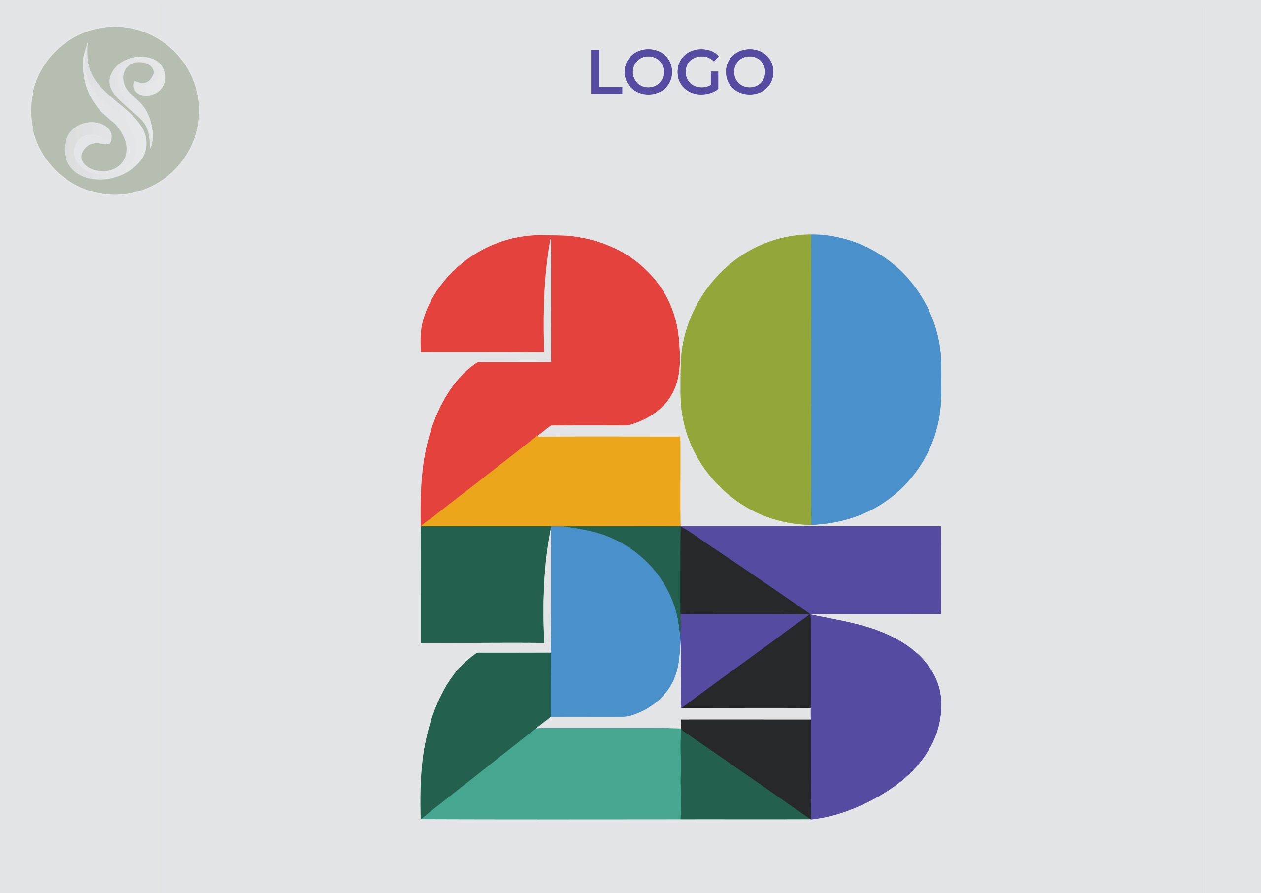
Example: A tech company showing how its AI algorithm evolved from 2018 to 2025.
Used for how-tos, user journeys, or system overviews.
Example: A SaaS product visually guiding users on onboarding steps.
Used to contrast two ideas, products, or trends.
Example: A branding agency comparing “Old Logos vs. New Logo Trends of 2025.”
Used to show ranking, priority, or organizational structure.
Example: A real estate firm displaying types of buyers ranked by budget.
Each type plays a unique role, and at SUCHI DESIGN, we tailor infographic design to brand tone, message clarity, and data complexity.
Real-World Examples of Infographics That Made an Impact The WHO COVID-19 Timeline GraphicDuring the pandemic, the World Health Organization’s infographic timeline helped millions around the world understand virus spread, global response stages, and travel guidelines. Clear icons, timeline flow, and color coding turned chaos into calm.
Amazon’s Seller Journey GraphicAmazon used a process-style infographic in their onboarding emails for new sellers. Instead of a 15-page PDF, a single scrollable image mapped out the entire journey—listing products to getting paid. Result: 27% faster onboarding.
LinkedIn’s B2B Marketing Funnel GraphicLinkedIn used a comparison infographic to show how traditional vs. digital funnels differ. The visual had a 38% higher engagement than their typical content pieces.
Why Brands Are Investing More in Infographic Design in 2025A recent Adobe Digital Trends report (2025) revealed that 67% of brands plan to increase visual content budgets, especially for formats that simplify data-heavy storytelling.
Key Drivers:-
Rise of Data-Driven Marketing: CMOs now demand ROI visuals, campaign analytics, and dashboards that speak to stakeholders.
-
Mobile-First Consumption: Infographics are perfect for small screens. You can't expect users to scroll through 2000-word documents on mobile.
-
Cross-Platform Compatibility: Infographics work on websites, pitch decks, newsletters, and social media.
At SUCHI DESIGN, we’ve seen our clients convert more leads, reduce explanation time, and improve team communication just by investing in the right data visuals.
Infographics in Different Industries EducationSimplify curriculum maps, learning outcomes, or admission guides.
FinanceVisualize investment portfolios, expense breakdowns, or tax policies.
HealthcareIllustrate patient pathways, medical results, or lifestyle tips.
Real Estate
Map market trends, location benefits, and property comparisons.
Creative AgenciesShowcase campaign reach, performance reports, and brand storytelling.
How to Make Infographics That Actually WorkInfographics are not just about “making things pretty.” They’re a collaboration between data, storytelling, design, and strategy.
a. Start with a QuestionEvery great infographic answers a single question.
Example: “What does our customer journey look like in 5 steps?”
Don’t dump raw Excel data into visuals. Choose the most relevant stats and eliminate the noise.
c. Design for ClarityUse brand-aligned colors, easy-to-read fonts, consistent iconography, and whitespace. Avoid clutter.
d. Add a Narrative FlowUse headers, subheads, arrows, and sections to guide the reader’s eye—like a good storybook.
e. Optimize for Each PlatformWhat works on LinkedIn may need resizing for Instagram. Make sure it’s readable everywhere.
At SUCHI DESIGN, we combine our design finesse with UX knowledge to make every infographic usable and impactful.
The Future of Infographics: Motion, AI, and InteractivityInfographics are evolving fast.
Motion InfographicsThese are animated explainer graphics that move data. Platforms like Instagram Reels, LinkedIn Videos, and website hero sections are demanding motion more than static graphics.
AI-Generated Data VisualsTools like Tableau + AI or Power BI + ChatGPT can generate charts instantly. But raw AI output still needs human curation and creative touch.
Interactive InfographicsThese are clickable visuals often used in product pages or reports where users can explore layers of information.
The future is not static. It’s dynamic, animated, and personal.
How SUCHI DESIGN Crafts Effective InfographicsAt SUCHI DESIGN, our approach is not template-based; it’s brand-first, message-driven, and visually masterful.
Our Process:-
Brief Analysis – Understand the data goal, audience, and channel.
-
Data Structuring – Curate the most relevant data for visual use.
-
Design Strategy – Choose the type, color palette, and layout.
-
Custom Iconography – Avoid stock clutter; we create from scratch.
-
Client Feedback Loop – Iterate with you to ensure clarity + creativity.
-
Platform Optimization – Final formats optimized for print, web, and mobile.
Whether it’s a launch report, investor deck, or Instagram carousel, we design with impact and purpose.
#suchidesign thought: The Infographic Advantage in 2025 and BeyondIn today’s noisy content landscape, those who can clarify the complex will lead. Data is only as powerful as the story you can tell with it—and infographics are your storytellers.
They are the visual bridges between your numbers and your narrative, your insight and your audience, your brand and your market.
Good data? Sure, that’s a start.
Great design? That’s the differentiator.
Let SUCHI DESIGN help you transform your stats, insights, and brand messages into scroll-stopping, decision-driving, beautifully crafted infographics.