Introduction: Trust Begins Before Words Are Spoken
In today’s hyper-competitive market, customers form their first impressions of a brand in as little as 50 milliseconds. That’s quicker than the blink of an eye. Before a potential client reads your mission statement, explores your offerings, or learns about your team, they see your brand. And what they see—your logo, color scheme, layout, motion, or typeface—speaks volumes.
At SUCHI DESIGN, we’ve learned one thing over and over again: design isn’t just decoration. It’s communication. It’s psychology. It’s strategy. It’s the bedrock of brand trust. This blog explores how design directly influences customer perception, decision-making, and loyalty—and how your brand can capitalize on it from day one.
The Psychology of First Impressions Design Is a Silent CommunicatorDesign communicates trust before a word is said. Elements like symmetry, alignment, spacing, and contrast aren’t just aesthetic decisions—they’re trust signals. A poorly spaced logo or inconsistent visual identity subconsciously signals disorganization, even if your product is stellar.
Studies in cognitive psychology show that users judge website credibility 75% based on aesthetic appeal. This applies to every customer touchpoint: your packaging, digital ads, motion graphics, and even the business card you hand out at events.
Colors and Emotions: The Palette of TrustColor plays a critical role in forming trust. According to research, color improves brand recognition by up to 80%. But more importantly, each color carries emotional weight:
-
Blue evokes calm, trust, and professionalism (used by tech and finance brands)
-
Red stimulates energy and urgency (used for youth-driven or sale-driven brands)
-
Green symbolizes growth, health, and nature (ideal for eco-conscious products)
-
Black represents luxury and sophistication
If your design uses the wrong palette for your brand personality, customers feel confused. That confusion dilutes trust.
Logo: The Flag of Your Brand NationYour logo is your visual handshake. In a world flooded with information, customers use logos to remember, differentiate, and emotionally connect with a brand.
Think Beyond Pretty ShapesGreat logos are:
-
Memorable (Apple’s bitten apple, Nike’s swoosh)
-
Scalable (looks good on a billboard or Instagram icon)
-
Timeless (not driven by trends)
-
Reflective of brand personality (a law firm logo should not look like a video game company)
At SUCHI DESIGN, we treat logo creation like identity mapping. It starts with who you are and ends with what you want customers to remember.
Real-World Example: AirbnbAirbnb rebranded its logo into the “Bélo” symbol—a combination of people, place, and love. The design shift wasn’t just cosmetic. It was a strategic trust rebuild after several trust-damaging controversies. The new identity symbolized openness, belonging, and safety, which was exactly what the company needed to communicate.
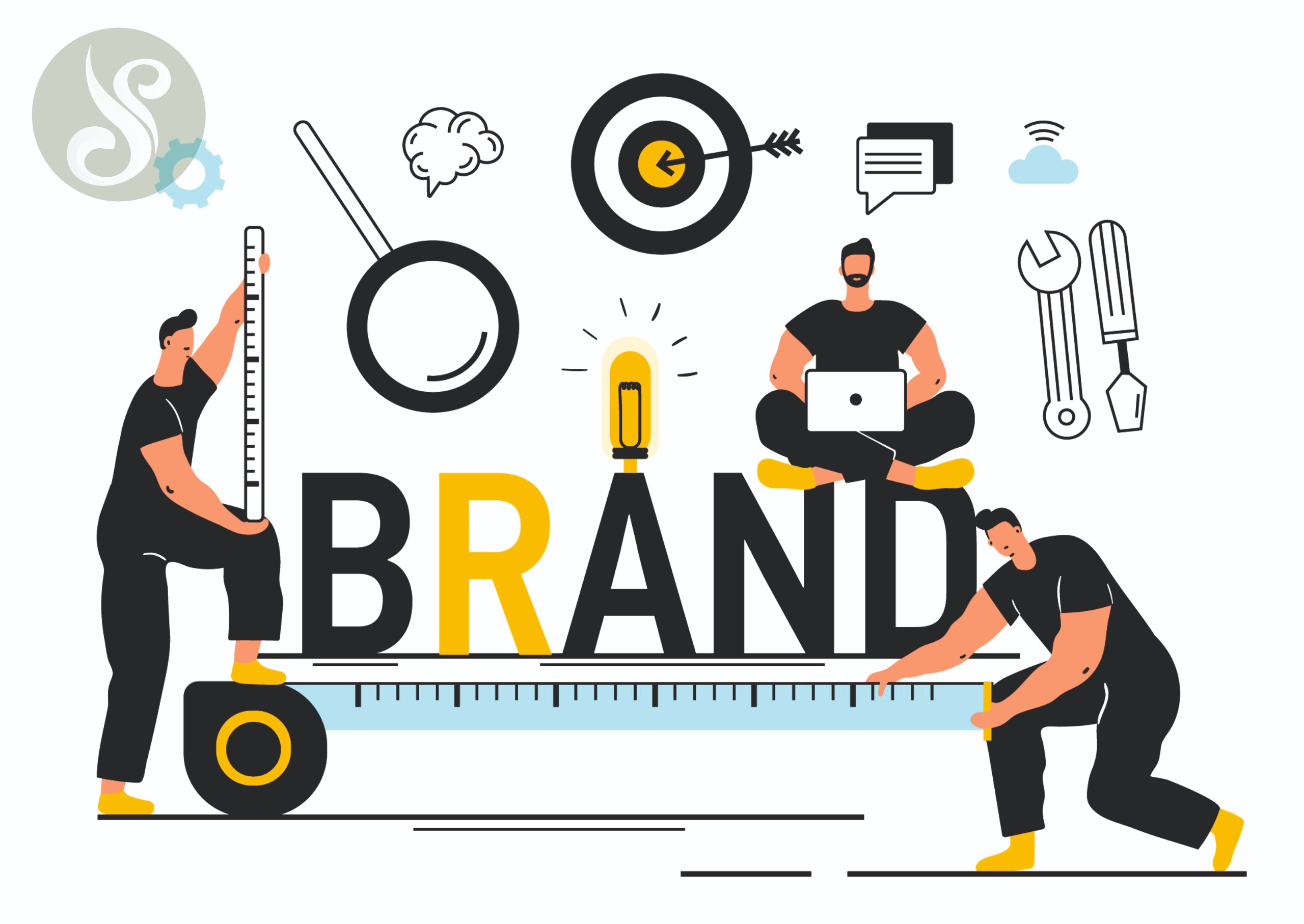
Brand Identity: Beyond Logos Consistency Breeds CredibilityImagine visiting a company’s Instagram that looks different from its website, which again looks nothing like their brochures. This inconsistency creates confusion, and in business, confusion kills conversions.
Brand identity includes:
-
Fonts and type hierarchy
-
Color palette and usage rules
-
Iconography
-
Motion style and graphic language
-
Layout grids
-
Voice and tone guidelines
When these are codified into a brand identity system, every customer interaction becomes a reinforcing act of trust.
Case Study: ZomatoZomato maintains a consistent red-and-white visual identity across food delivery bags, mobile apps, and social posts. This builds familiarity. In a market where competitors launch every week, Zomato’s consistent design cements its top-of-mind recall.
Motion Graphics and Trust-Building Static Tells, Motion ShowsMotion graphics—when done right—create immersive experiences. A motion graphic explaining how your SaaS product works or how to apply your skincare range builds confidence. It removes ambiguity. It humanizes your product.
When customers see the journey in a few engaging seconds, they feel more secure moving to the next step: inquiry, sign-up, or purchase.
Example: Duolingo’s Visual EngagementDuolingo uses friendly animations to encourage language learning. These quirky, expressive, and on-brand visuals build user engagement and emotional trust, especially in a sector where apps often feel robotic or impersonal.
Infographics: Trust Through ClarityIf design is about visual communication, then infographics are its high-performing employees. They simplify the complex. They translate data into insight.
In a B2B context, a well-designed infographic about industry trends builds your credibility. It says, “We know our space, and we can help you make sense of it.” That establishes trust before you’ve even pitched.
Design Tip from SUCHI DESIGN:Avoid overloading your infographics. Visual breathing space matters as much as content.
Ad Creatives: Micro-Impressions with Macro ImpactDigital ads don’t get second chances. They interrupt, compete, and disappear in a scroll. Your ad creative must build trust in under 3 seconds.
How?-
A clear visual hierarchy
-
On-brand colors and fonts
-
Professional artwork
-
Thoughtful motion or transitions (in video ads)
-
Cohesive tone across platforms
Your Facebook ad and Google Display ad should look like they belong to the same family. A customer who sees one and recognizes the other instantly builds subconscious trust.
Real-World Repercussions of Bad DesignLet’s flip the script. Here are real examples where poor design cost brands their trust:
-
GAP’s logo redesign (2010): A sudden logo change led to massive backlash. It was perceived as unprofessional and unaligned with the brand’s legacy. Within a week, GAP reverted to its old logo.
-
Pepsi’s confusing brand update (2008): Pepsi’s redesign cost over a million dollars and received heavy criticism for lack of clarity and coherence.
Design isn’t just surface-level—it’s brand equity. One misstep can erode years of brand-building.
Suchi Design’s Philosophy: Style That Serves StrategyAt SUCHI DESIGN, we don’t chase trends. We chase purpose. Our design process revolves around aligning brand goals with customer psychology. That’s how trust is engineered.
Our services don’t just “look good.” They:
-
Solve communication problems
-
Increase engagement
-
Drive recall and recognition
-
Shorten the buyer journey
Whether it’s a logo, an animated explainer, or a packaging label, we ask: Does this help the brand earn trust?
#suchidesign: Your Design = Your Reputation
The journey of building trust starts with a pixel. Every color, line, font, and animation is either earning or eroding your customer’s confidence.
In an age where attention spans are fleeting and skepticism is high, design is your most powerful trust-builder.
So next time you think of branding as “just making things look good,” remember this: A good-looking design gets noticed. But a trust-building design gets remembered.
If you're ready to make an unforgettable first impression with design that earns trust, Suchi Design is here to guide the way.